How to Mix and Match Frame Styles
Learn our 6 tips to create a custom wall display.
Published on June 23, 2022

A wall collage allows your clients to enjoy their favorite images and lets you make multiple sales from one session. Offering Framed Prints are a classic and timeless choice for your clients to invest in.
You can make purchasing a wall collage a positive, effortless, and high-end experience for your clients. If you’re looking get started, just 3 or 4 photos can make some amazing wall art.
We have 6 tips when it comes to mixing and matching frame styles in a wall collage:
1. Use photos from the same session to tell a story
Images from the same shoot that share similar tones and colors can create a unifying theme, even if the frames are different. For instance, capture images of each child and family member, favorite moments from a couple’s wedding day, or senior portraits that highlight their personality.
2. Choose your statement piece
Select the main image you want to highlight as the focal point and pair it with your or your client’s favorite frame.
3. Same moulding, different color
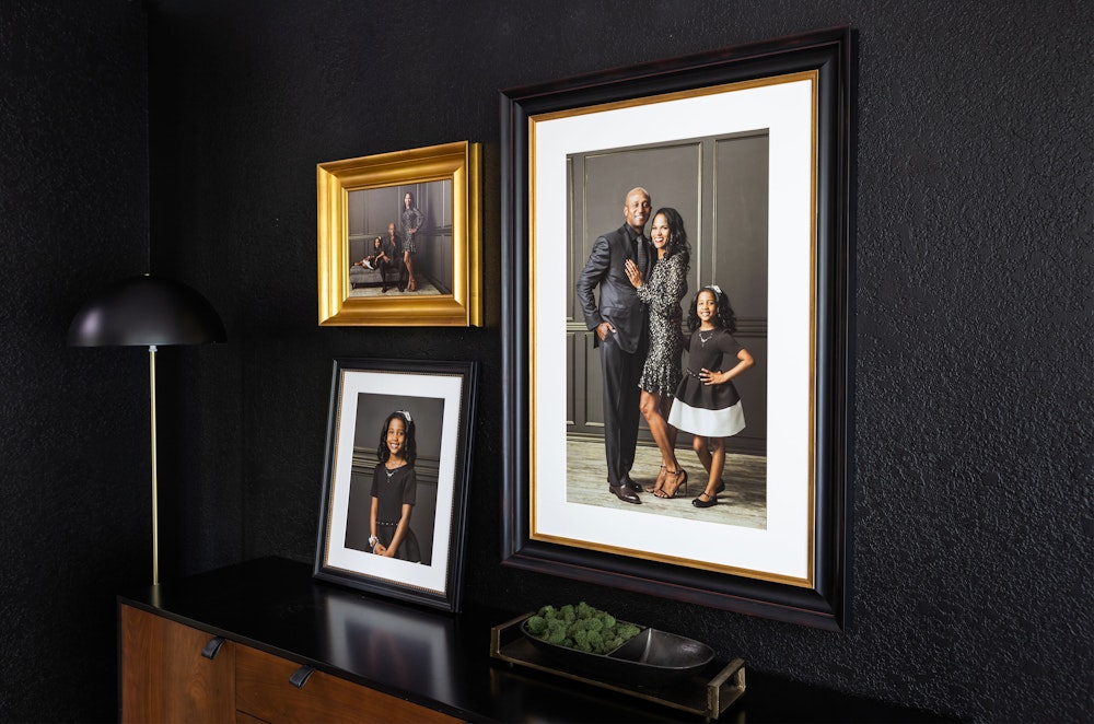
Find a frame style that offers mouldings in various, complimentary colors. We recommend starting by only pairing 2 colors together, and not all the options. Make the second largest frame a different color from the first. This method can create a beautiful, cohesive look on any wall.
Suggested Color Pairings
- Academie Black and Academie Gold frames
- Modern Metal Black with Modern Metal Gold or Silver
- Gallery Fine Frames in Black and White
4. Experiment with different mouldings
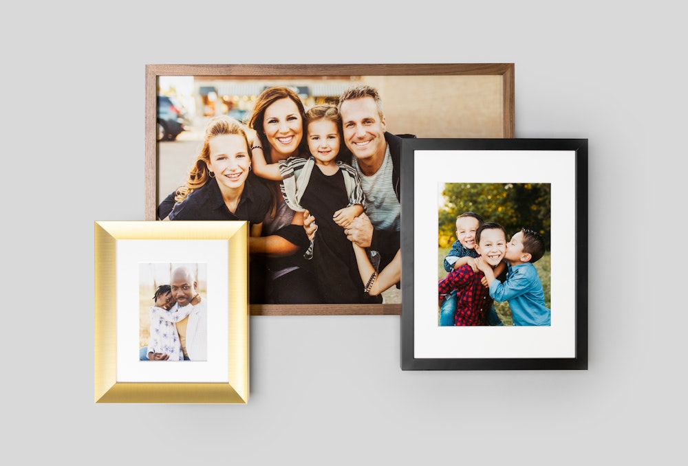
This one requires trust in your own interior design abilities, but it’s very doable. Don't feel you have to make it all the same frame, mix it up by selecting 2 or 3 styles that feel cohesive to give your display character and detail.
Pick your or your client’s favorite frame style to be the large statement piece, then select a complimentary style to pair with it. Or, select frames of similar colors, such as different styles but all in black.
Suggested Moulding Pairings
- If you like thick and ornate, try combining our Academie Frames with Hudson Frames.
- If you like thin and sleek, try our Woodland, Metal, or Gallery frames together.

5. Don’t forget the mat
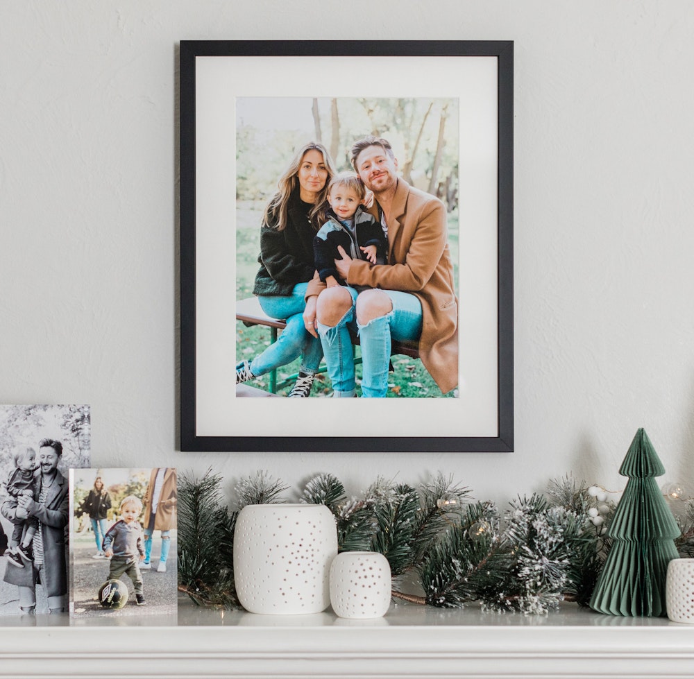
Mats can be the unsung heroes of this whole thing. By adding a mat, you can help draw attention to your client’s images. Mats help anchor your layout visually. Choose a select mat width or add a thick mat to create an upscale appearance.
6. Experiment with sizes and orientations
These are a couple more variables that can help your layout stand out and give it visual interest. Select an alternate orientation with a thinner frame to enhance or complement your main statement piece.

Design Wall Collages with Our App!
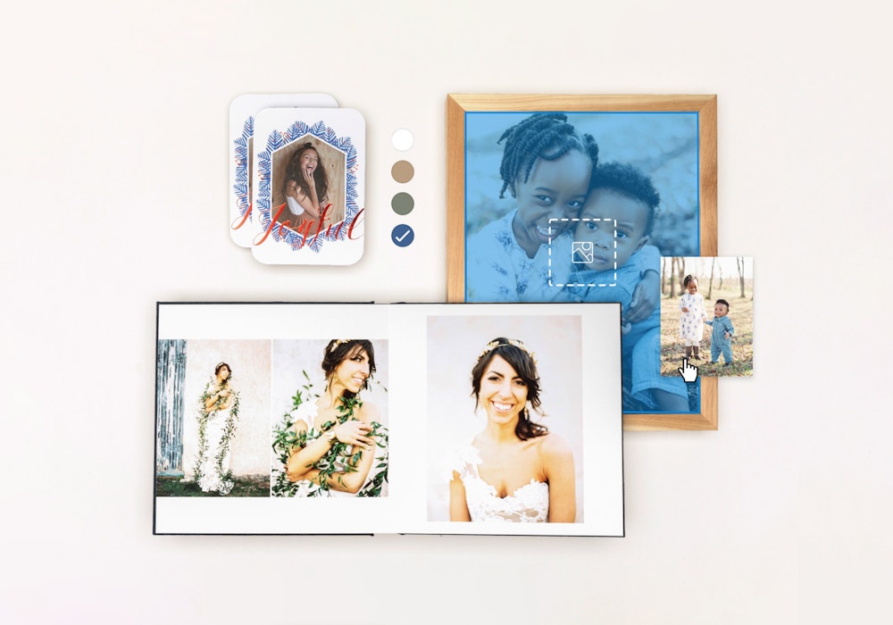
Have you tried the WHCC Studio iPad app? It’s a super easy way to create wall collage renderings for your clients using actual images of their spaces.


